 Microsoft IDC · Hyderabad
Fitting all of Office onto a 2.4-inch screen.
I was lead interaction designer for five flagship Office Mobile apps on Windows Mobile — rebuilding Word, Excel, PowerPoint, OneNote, and SharePoint for the device, not the laptop.
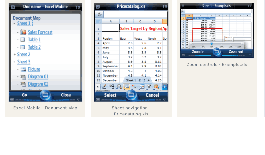
Excel Mobile — document-map navigation, sheet navigation, and zoom controls.
Office was the franchise. Mobile was the unknown.
Office generated over 90% of Microsoft Business Division revenue, and Office Mobile shipped pre-installed on Windows Mobile — the leading Microsoft smartphone platform of the period. The franchise was enormous; the canvas was tiny.
The conflict was physical. A spreadsheet, a deck, an enterprise document library — each had to work on a 2.4-inch screen driven by hardware soft-keys, with no touch to fall back on. Desktop menu models simply didn't transfer. And every decision had to hold across five apps, five product managers, and multiple engineering teams.
- Constraints I designed within:
- The Windows Mobile soft-key paradigm — two physical keys, no touch on most devices.
- One interaction model that had to stay consistent across five very different apps.
- International markets — accessibility and localization had to be in the spec from the start.
Eight users, five apps, one phone.
In August 2008 I ran a moderated usability study at Microsoft IDC — eight Windows Mobile users performing real Office tasks on a Samsung Mirage, captured on video — alongside card sorting and heuristic reviews of the competition. Three findings shaped the system.
Navigation had to be reimagined, not shrunk.
Card sorting validated a document-map hierarchy — a structural overview users could jump through — rather than forcing the desktop menu tree onto a small screen. It became the backbone of navigation across the suite.
The soft-key paradigm needed a workflow-aware command bar.
Commands couldn't live in nested menus. Sessions showed users needed the right two actions surfaced for their current context — so I designed a command model that adapted to the task instead of a static menu.
The competition revealed the gaps to exploit.
Heuristic reviews of BlackBerry, Symbian, and the early iPhone — run before design phases — exposed where mobile productivity was weakest, and where Office Mobile could lead rather than follow.
Specifying how a list should scroll.
The hardest exploration wasn't a screen — it was behavior. How a list view felt as you entered it, held it still, flicked it, and let it settle had to be defined precisely enough for engineering to build, and consistently enough to feel like one product across five apps.
Per-app menus & mockups
- Five apps would each drift into their own interaction dialect.
- Static visual comps left motion and state up to interpretation.
- No shared vocabulary for development to build against.
A shared, four-state list spec
- Entry, static, panning/flicking, and motion — each state defined.
- One pattern adopted across all five Office Mobile apps.
- Ship-grade specs Development and Test built from directly.
Why it mattered: by authoring the interaction spec — not just mockups — I made my judgments part of the shipped product. The same list-view behavior, layout grids, and selection states carried Word through SharePoint, so the suite felt like one system instead of five teams' guesses.
Five apps, each built for the phone.
The document-map model and adaptive command bar resolved into five shipped experiences — plus a run of Office Accounting, SNAP, and Office Live work across the same tenure.
Excel Mobile — the document map gave users a structural way to move through a spreadsheet on a tiny screen.
Word Mobile
Document-map navigation and a mobile reading flow — the pattern that anchored the rest of the suite.
Excel Mobile
Sheet and table navigation, zoom controls, and in-cell editing tuned to the soft-key command model.
PowerPoint Mobile
Slide-jump navigation, full-screen rehearsal, and in-line commenting so reviewers could annotate decks on the move.
OneNote Mobile
The first mobile companion for OneNote — recent-pages list, quick-note capture, and notebook-section navigation.
SharePoint Mobile
Enterprise document libraries with meeting-mode views and an offline-aware sync pattern.
Beyond Office Mobile
Office Accounting 2007 add-ins (Fixed Asset Manager, PayPal), Microsoft SNAP dashboards in Excel and Outlook, and the Office Live SMS Campaign Manager.
Ten shipped products, on tens of millions of phones.
Office Mobile reached the global smartphone install base of the era, pre-installed across HTC, Samsung, Motorola, LG, HP, Sony Ericsson, and Palm devices.
What I'd do differently
I treated the usability study as validation near the end of a design phase. With five apps and five PMs, I'd now run that research continuously and earlier — a standing cadence rather than a milestone — so cross-app inconsistencies surfaced while they were still cheap to fix, instead of being reconciled in spec after the fact.